


Users of GMail should be familiar with sliding effects of the inbox side navigation. In the most recent design you will find the GChat/Hangouts box along with other various email tags(inbox, trash, etc.). When you have a large number of links in that menu some will be hidden by default, and then expanded further once you hover. I really like this technique and I feel it is easy to replicate with just a few CSS3 effects.
In this tutorial I want to demonstrate both a horizontal and vertical menu with hidden content. As you hover, the CSS transition properties will expand to reveal more content, and then retract after losing focus. Many of these techniques can also be enhanced using jQuery UI easing effects, but CSS3 is a nice place to start because you are not reliant on any other 3rd party libraries. Check out my live sample demo to get an idea of what we are creating.

Live Demo – Download Source Code
The two navigation menus are not overly complicated aside from typical HTML elements. I am using a copy of the jQuery library as a fallback for the CSS3 animations, along with a custom Google Web Font. Inside the page body I setup two main divs labeled #sidebar and #maincontent.
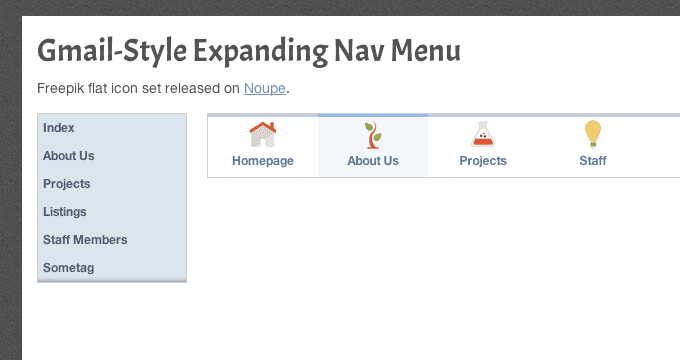
<div class="container clearfix">
  <div id="sidebar">
	<div id="vertical-nav">
	  <ul>
		<li><a href="#">Index</a></li>
		<li><a href="#">About Us</a></li>
		<li><a href="#">Projects</a></li>
		<li><a href="#">Listings</a></li>
		<li><a href="#">Staff Members</a></li>
		<li><a href="#">Sometag</a></li>
		<li><a href="#">Another Page</a></li>
		<li><a href="#">Lorem Ipsum</a></li>
		<li><a href="#">Last Page(maybe)</a></li>
	  </ul>
	</div><!-- @end #vertical-nav -->
  </div><!-- @end #sidebar -->
  <div id="maincontent">
	<div id="horizontal-nav">
	  <ul class="clearfix">
		<li><a href="#"><span class="navicon"><img src="images/home.png"></span>Homepage</a></li>
		<li><a href="#"><span class="navicon"><img src="images/root.png"></span>About Us</a></li>
		<li><a href="#"><span class="navicon"><img src="images/flask.png"></span>Projects</a></li>
		<li><a href="#"><span class="navicon"><img src="images/bulb.png"></span>Staff</a></li>
		<li><a href="#"><span class="navicon"><img src="images/letter.png"></span>Contact</a></li>
	  </ul>
	</div>
  </div><!-- @end #maincontent -->
</div><!-- @end .container -->
Each navigation menu is designed using an unordered list of links. The container div is given a specific ID pertaining to #horizontal-nav and #vertical-nav. This is helpful when we need to recognize hover events in CSS3. Obviously you can update this to be any container element within your own codes.
Also in the horizontal menu each link includes a span with the class .navicon along with an internal icon image. The interface is supposed to conceal each link text and only display an icon at first, which then reveals more content as you hover. The links could even include subtext if you wanted a super-detailed navigation.
Style & Animate with CSS3
We can start delving into CSS by looking at the vertical menu first. The initial properties setup a height at 170px which is the fixed design for my layout. The links expand well beyond 170 and these are kept off the page using overflow:hidden.
/* vertical navigation */
#vertical-nav {
  display: block;
  overflow: hidden;
  height: 170px;
  background: #dbe4ee;
  border: 1px solid #ccc;
  -webkit-box-shadow: inset 1px -8px 8px -9px rgba(0,0,0,0.7);
  -moz-box-shadow: inset 1px -8px 8px -9px rgba(0,0,0,0.7);
  box-shadow: inset 1px -8px 8px -9px rgba(0,0,0,0.7);
  -webkit-transition: height 0.4s linear;
  -moz-transition: height 0.4s linear;
  transition: height: 0.4s linear;
}
#vertical-nav:hover {
  height: 280px;
}

#vertical-nav ul { list-style: none; }

#vertical-nav ul li { display: block; font-size: 1.2em; font-weight: bold; }

#vertical-nav ul li a {
  text-decoration: none;
  color: #4f5e70;
  display: block;
  padding: 8px 5px;
}
#vertical-nav ul li a:hover {
  background: #fff;
}
The transition properties will only expand once you hover over the navigation. Once your mouse is off that div it will automatically reverse the transition effect. This is a nice way of writing code because you only need to declare one set of transitions and CSS3 will handle the rest.
With the horizontal navigation I set things up in a similar manner. I am using a fixed width of 552px on the content section because this perfectly encapsulates each menu item. Without the borders it might fit into any place on the page, but I am using this demo for better clarity. The default height is set at 38px which is just enough to display icons without the text.
/* horizontal navigation */
#horizontal-nav {
  display: block;
  overflow: hidden;
  height: 38px;
  border: 1px solid #cdcdcd;
  -webkit-transition: height 0.2s linear;
  -moz-transition: height 0.2s linear;
  transition: height: 0.2s linear;
}
#horizontal-nav:hover {
  height: 65px;
}

#horizontal-nav ul { list-style: none; }
#horizontal-nav ul li { display: block; float: left; width: 110px; }

#horizontal-nav ul li a {
  display: block;
  width: 100%;
  padding-top: 2px;
  padding-bottom: 10px;
  font-weight: bold;
  font-size: 1.2em;
  text-align: center;
  text-decoration: none;
  color: #5c789a;
  border-top: 3px solid #c1cddc;
}
#horizontal-nav ul li a:hover {
  border-top-color: #96bae6;
  background: #f3f6f9;
}

#horizontal-nav ul li a .navicon { display: block; width: 100%; text-align: center; margin-bottom: 4px; }
This hover style works the same way by targeting #horizontal-nav and then adjusting for the new height value. Additionally you may notice that I have created anchor hover link rules for the internal items. The border color will update on hover but it does not follow the same transitions. These can be duplicated to apply onto the anchors, but the effect looks brilliant either way.
Using a jQuery Fallback
If your visitors are using older browser versions then it may be worth catering to this crowd with jQuery animations. Typically the event handler .on() is enough to get this working but we can simplify the process by using .hover(). This function allows for two parameters defining actions on the mouseenter and mouseleave events.
$(function(){
  $('#vertical-nav a, #horizontal-nav a').on('click', function(e){
    // stop anchor links from loading
    e.preventDefault();
  });


  $('#vertical-nav').hover(
    function(){
      $(this).animate({
        height: '280px'
      }, 300);
    },
    function(){
      $(this).animate({
        height: '170px'
      }, 300);
    }
  );
});
This JS code can be found at the very bottom of my index.html file. In the demo I have this commented out so that jQuery effects are not running. However you should leave these in if you feel that your audience will not mostly support CSS3 transitions. The jQuery .animate() function is really easy to learn and it behaves similar to the transitions, except you will need to define actions for both states of hover/non-hover interactions.
Also the small tidbit at the top of the script is for handling click events onto the menu anchor links. The default HREF value is set to a hash sign(#) which doesn’t do much aside from jump to the top of the page. We can stop this value from loading with the e.preventDefault() method placed inside a click event handler. If you are using my demo code then be sure to remove this block or else your anchor links will not load anything!
Live Demo – Download Source Code
Final Thoughts
The expanding navigation technique is not anything new and it certainly wasn’t invented by Google. Their GMail interface is a great example of modern web applications running a fantastic user interface design. I hope these codes are useful to other developers who would want to build something similar in their own websites. By keeping jQuery as a fallback method you can ensure almost every browser will be supported.