Last Updated on November 9, 2015 by Laura Coronel
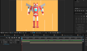
Hi, I’m Jake, a Motion Designer here at Treehouse. We use a lot of animation and motion, and some of you have been asking to learn more about it in our Community forums. This post is intended to give you a glimpse into our process using this transforming robot as the example. I’ve also provided a version of the After Effects file for educational purposes, in case you would like to play around with the robot yourself.
Play Gif
Also, even if you’re familiar with Motion Design, I’m going to share some insight into my personal method for creating the Treehouse motion look, which might give you some good tips for your own process. Let’s get started.
Why Animation and Motion?
Great design, enjoyment of our courses, and serving our students are fundamentals of the Treehouse experience. The Motion Team believes in our mission, and loves being a part of the learning process.
Animation helps educate, entertain, explain a complex idea or no idea at all. It’s a way to speak to everyone. I enjoy breaking down abstract ideas or complex lessons into simple metaphors. Or sometimes just seeing what’s happening under the hood when you implement code or access a database can be extremely helpful in getting a fundamental grasp of the subject. It’s an important part of our teaching process, and hopefully helps break up the monotony of a teacher just talking over a frozen computer screen.
Before I begin the animation or design concept, here is my thought process…
Three main principles of Treehouse design for teaching:
- Teaches subject manner effectively in a simplistic way.
- Fun and engaging.
- Retain a high production value while also meeting a deadline.
Questions I ask myself before designing the segment:
- Does this animation have to be literal or can it be an analogy?
- How can I interrupt the request to make sure the core of the teachers lesson is presented in a fun way?
- What do I need to design, based on the idea I’ve come up with?
- How will the design elements move?
The Process
Usually, it all starts with the Teachers. They write a script, gather ideas for where they want to show motion and what concepts they feel animation will help explain. Then pass it over for a design review by a Motion Team member. Much like you would with a client, except our clients are our Teachers and our Students are the target audience. For example, let’s say the teachers concept would be easily explained by using a transforming robot who rockets off the screen. Why not.
We’ll be creating the assets in Adobe Illustrator (we try and keep everything vector and flat as is our design style, so we avoid Photoshop), and animation them in Adobe After Effects. AE isn’t perfect for this kind of work, but for the cost and ease of transferring into a video editing pipeline, it’s the best available option right now. Some people use Flash, but I have personally found it difficult to get precise video sizes and timing in a pipeline like ours, that and I’m more accustom to AE in general.
There are other options out there like Toon Boom, or CelAction2D, but the cost and detail/time they require are tough to justify for our current needs.
Once in a while, I’ll create our look with 3D objects in Autodesk Maya. I’ll try to follow up with a later post detailing my 3D/2D workflow for those of you interested.
Asset Design
So, we have our script and motion concept. Sometimes we storyboard it out, sometimes we design a frame of the concept if we feel we need to get an additional OK from the education staff, but we work with fast turns and effectively small teams. Sometimes we just go for it.
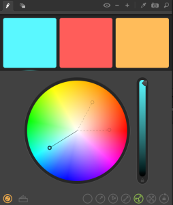
Here’s where the fun begins, first we pick a background color from our brand swatches, then I like using an Apple App called Spectrum to kinda help me decide what colors might go with it.
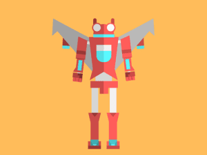
Looking up some references to get a good handle on the direction you want your design to take is always great. I love 80s Japanese Robots. I wanted to make the transformer/bot live in that style.
After getting an idea of the general look and working from there, I go through a few different designs till I settle on the final. Always consider:
- What will move?
- What needs to be detailed?
- What’s important to the animation and what is important to the design?
Here’s some of the initial ideas:
Final design:
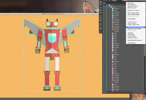
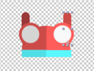
Now that we’ve got our flying robot, it’s time to break him into layers for animation. You must have every element you want to be separate in its own layer in Illustrator in order to have them as separate items in After Effects.
I generally do a Release to Layers (sequence) in AI ( Illustrator) to just break apart the pieces into layers.
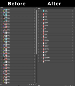
It’s messy, so you’ll need to clean it up before using AE. Generally, the way to go is to group elements that are planned to be animated as one piece into the same layer and label your layers. It’s easier to do this sort of planning in AI than AE so you don’t have to Pre-Comp and Parent a million layers that do not have to have separate controls for animation.
Now that the layers are organized, it’s time to go to AE.
Animation Setup
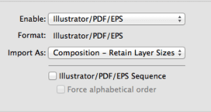
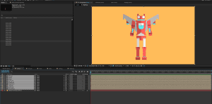
When you import your AI file, you want to set it to Import As: Composition – Retain Layer Sizes. This will keep the layers in the right places and make it a little easier to set the center points to create your “rig” for this character.
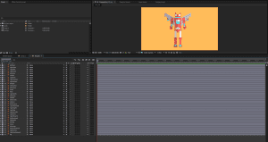
The file should import in its own Comp with the layers in a folder in the Project Window, when you open its Comp, all your naming and grouping work you did in AI will carry over.
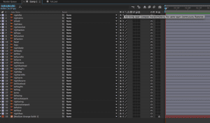
It’s a good idea to go ahead and select the Continuously Rasterize buttons for your vector layers. That will make AE update the vector every time it refreshes the screen keeping clean crisp lines. You can’t just turn it on on the Comp level, every layer from the top down needs to be checked. It’s one of the more annoying things in default After Effects when working in an all vector environment. If you’re using a base background that doesn’t move like I am, go ahead and lock that layer while you’re down there.
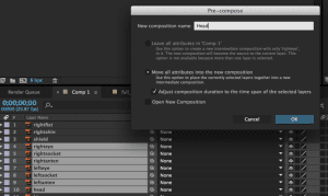
Start Pre-Comping to get elements that animate in a larger group but at the same time need to animate on their own within that group. The more you do it, the more you’ll know what you should Parent, Pre-Comp, or leave alone. Again, this is another process that might feel like a pain. It’s key to saving headaches later and reusing this character for other animations or Animators.
Keep in mind, every item and character has a different need or complexity based on what you’re doing with it and what you need to animate. Generally, I try to make it possible for a variety of needs.
Once you have your Layers and Pre-Comps all set up, its time to move center points. It’s basically the axis to which the layer pivots. you need to set this before setting keyframes. For example, I moved the head antenna center point down to the layers base because I want some secondary action when I pop the head up from the robots chest. In order to do that, I need to have the layer setup with the axis I need. This goes for every layer you want to animate. Since this is a transforming Robot where just about everything moves, we got some work to do. .
Now that the “rig” or setup is complete, we can finally start putting some life in him. You’ll notice I changed the feet a little, made more sense for the animation once I got into it. If you don’t have any strict art direction, its always good to test the designs movement and make changes if you need to.
Animation
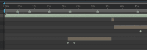
For this animation, there is no Voiceover I need to time to, if there was, I’d use the * key to mark the timeline while playing the .wav file to have a rough idea where things happen.
A few things I love using, there’s a Bounce script I like for adding some automation. I originally saw this on the website Greymachine , he’s got some great stuff. Real early contributor to the After Effects community.
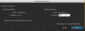
It’s easy to modify his scripts to get what you want. I generally set the decay to match the speed of my keyframe Velocity which controls the ease and speed of the motion curve.
This window should be your friend.
Here’s the simple Bounce script. If you’re a bit of a coder, you can make it a drag and drop along with a slider to control your decay rather than doing it manually.
Just copy and past it as an expression to just about any keyframable property to get a nice oscillation effect.
amp = .1;
freq = 2.0;
decay = 6.0;
n = 0;
if (numKeys > 0){
n = nearestKey(time).index;
if (key(n).time > time){
n–;
}}
if (n == 0){ t = 0;
}else{
t = time – key(n).time;
}
if (n > 0){
v = velocityAtTime(key(n).time – thisComp.frameDuration/10);
value + v*amp*Math.sin(freq*t*2*Math.PI)/Math.exp(decay*t);
}else{value}
OK, as we animate, just pay attention to weight, movement, scale and add as much secondary motion as possible to make it interesting and fun. At this point, its up to you. I hope to add a new blog soon that gets into the 12 fundamentals of animation and some in-depth examples on a more complex character.
For the most part, I like just hand animating most things and not using a lot of plugins, canned ease, automation or physics. Generally I stick to the bounce expression and maybe the Wiggler for anything extra.
Play Gif
Before we finish, I want to add some speed lines for FX in a loop and some engine fire from the wings. This is the final you saw at the top of the blog.The whole point of the wings opening is to accelerate and go up. The speed lines should adjust accordingly to add that sense of momentum and change in direction. Plus, they are fun.
Play Gif
When it’s done, we like to render it in an Animation Lossless codec HD 720 or 1080, and send it off to editing for SFX and get added to the timeline. The video editors will do the compression we need. We render out full resolution as to avoid color shifts and double compression passes before it hits the site to ensure maxim quality. For fun, I like to take an 800 x 600 render into Photoshop to make an animated gif loop for Dribbble.
Quick Dribbble tip for Gifs.
If you’re a Dribbble user, remember you can’t pick your thumbnail at this time. For that reason, I like to Pre-Comp my animation, split it around the middle and move the end to the front making a stable loop showing the first frame where I want the thumbnail to be. Though I didn’t realize that in the beginning, it helps get views if the thumbnail is set up right.
And you get a good thumbnail for the gif loop.
Play Gif
Well, that’s about it for the overview. Feel free to ask questions or comment below. Enjoy the file, it’s a simple rig of the bot to mess around with. Let me know if you animate anything!
Thanks for reading!
Jake Kemper








whats the process of exporting an animation for use in a mobile app? colour profiles etc things to consider…
Hi Nathan! As this is an older post, we’d recommend asking your question in the Treehouse Community where Treehouse students and teachers are always happy to help answer questions.
Hi Nathan, I’m going to get with our mobile team and see what worked best as we recently did some animation for our Treehouse app and probably write up an article in the coming weeks as its been a popular question. There is some color considerations, but given the advancement of phone screens its more format , length, and ease of design that matter more.
Thank you for sharing. Did you use some a workflow solution to manage all this stuff? Many advised to use Jira for the purpose, though we’re using Pyrus.com and not only for these, but many other office needs. What is your experience of using a PM/worflow tools?
Hey Alex!
Right now we use a well laid out file/folder structure. After Effects also has a great project collect feature and we keep that same structure backed up on our server and Google Drive. Our projects are not long term enough, or have a lot of people working on them congruently to really need a fancy organizational method.
We use Asana for general project management among other teams. In the past we’ve also used Trello. Something I still use for personal projects.
Thank you so much for this helpful breakdown.
The animation in the Treehouse tutorials is top-notch and enables a really high quality experience.
Thanks! My team and I love making them! Being a part of the education process is very fulfilling. Glad you enjoy them!
Thanks for the Great post :D,
I wish if there is a full course in Treehouse about Animation and Motion.
Who knows! For now I’ll pass on some advice, learn some coding as well. its helped me out a lot as an artist. JavaScript, Python, and C# are used often in animation packages… Treehouse is great for that, and who knows whats down the road for us.
Woohoo!
I sent this in as a Feature Request early last year and it’s awesome to see that you guys have listened to everyone and put this post out! I’m no designer but always wanted to try a bit of Animation out so I’ll be sure to give this a go some time soon 🙂
Thanks for the support Harry! More posts along this lines to come. Feel free to tag me in the forums if you have any animation questions! @jakekemper or whatever comes up once you type that in the autocomplete box.
Simply awesome! I would love to see you teach a motion design course on Treehouse!
Elian,
Thanks for the support! I plan on writing some more posts along this vein. Check out Nick’s Game Design courses with Unity. They are programming based ( which is hard to find in an online game course) but paired with the new Maya courses, will start getting into a bit more of this. For now, getting a fundamental understanding of code helps anyone ( even animators) excel. But hey, you never know whats on the horizon for Treehouse!
I have been really interested in these bold style animations for a while, but I always hit a roadblock as all tutorials are using Adobe After Effects. Now I no longer use Adobe software I’m not willing to pay for the full suite each month for one app.
Is there any alternative that comes even slightly close to getting the same or similar results?
Many thanks
Sul
Hello Suliman!
Well, as mentioned in the article, the only software I can recommend thats not Adobe, that will give you both a method of creating elements, like Illustrator/After Effects combo, and give you quality animation tools is ToonBoom. Its got a big upfront investment but if you’re not interested in a subscription software, you own it. For me, I feel subscription based software is the most economical when you add up the tool sets and the automatic version upgrades. Yeah, look into ToonBoom , I do like their software, its just not the same workflow as AI to AE . IF anyone has a different tool set idea, all for hearing about it!
Jake