
Last Updated on May 21, 2015 by Laura Coronel
(Photograph by Flickr user Banzai Hiroaki)
Affordances are clues about how an object should be used, typically provided by the object itself or its context. For example, even if you’ve never seen a coffee mug before, its use is fairly natural. The handle is shaped for easy grasping and the vessel has a large opening at the top with an empty well inside. The object “affords” being picked up, meaning that it is able to be picked up. It also affords drinking out of. These are the things it’s designed to do, and that’s also what it looks like it’s designed to do.
A coffee mug might also afford holding writing utensils. It could be used as a pot for growing small plants, a shovel for building sand castles, or maybe even a ladle for serving punch. Well designed objects like coffee mugs have stood the test of time because they afford a wide variety of uses, many of which the original designer never intended.
Digital Affordances
Thinking in terms of affordances and metaphors can help lead to more intuitive user experiences. At first, applying the concept of affordances to digital interfaces might seem counterintuitive, mostly because the model of interaction doesn’t involve the direct manipulation of physical objects. However, I think affordances are about setting up expectations and then delivering on them.
Affordances are everywhere in the digital realm. As an example, consider a simple submit button. If it were just blue text, would you be able to tell that it’s interactive? Perhaps if that blue text were surrounded by the context of black paragraph text, it might stand out like a hyperlink, but for the sake of this exercise let’s assume this submit button is part of a web form. If that blue text were surrounded by a gray background, would you be able to tell then? Perhaps, but it might involve some thought before using it. Now, what if that button had some embellishments that made it look more akin to a button in the real world?
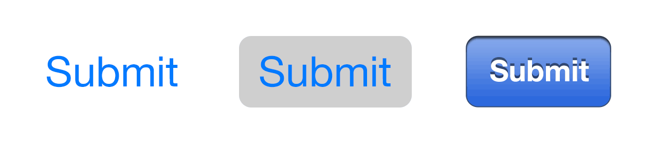
What are the visual cues that indicate that a button is, in fact, a button?
The buttons in the image above are from iOS. The left button is from iOS 7, the middle button is also from iOS 7 but with the “button shapes” accessibility feature turned on, and the right button is from iOS 6. This, in fact, is one of the major complaints about the redesign that came in iOS 7; buttons no longer have any kind of border or embellishments. I think most people have since become accustomed to the new look for iOS, but there certainly was an adjustment period. That’s because the design was not familiar, and thus, it had more difficulty setting up proper expectations.
So then, if affordances are about setting up expectations and delivering on them, let’s explore some specific types of affordances that enable good design.
Labels
The most direct type of affordance is a label. If an interface is targeted at beginners, or if the interface is fairly complex and includes many abstract concepts, then labels are a good way to explicitly indicate function.

Photograph by Flickr user Dave Wilson
Imagine how much more memorization and training would be necessary if the interior of a spacecraft relied on pure iconography. As it is, an extremely small percentage of humans are capable of spaceflight, and that’s only after many years of specialized training. It might actually be impossible without the use of labeled buttons and clear instructions.
Now imagine if a web form had no labels and you were expected to know what to type into each field. Every web form is a little different, so there’s no pattern you could follow. You might still be able to rely on form validation and go through a process of trial and error, but it would be incredibly frustrating. Labels help people organize and understand the choices that are being presented to them. It may not always be the most aesthetically pleasing affordance, but it is the most clear and precise method of communicating functionality.
Metaphors
Metaphors in web design might come in the form of words or imagery that’s used to communicate something other than literal meaning. For example, I’m using WordPress to write this article right now, and there’s an option in the sidebar menu that has an icon of a wrench and the label “Tools”.  I have enough experience using software to know that this is not literally a list of physical tools that I can use or purchase. However, I don’t have a ton of experience with WordPress, so while I have some idea of what might happen if I click, I’m not entirely sure what’s behind that menu item. And maybe that’s the intention; to hint at functionality and invite further exploration.
Take this a step further: If someone has never seen a wrench before, or if they’re not familiar with the word “Tools” in the context of a digital environment, this affordance has the potential to backfire and set up the wrong expectations.
You have to understand the underlying meaning of a metaphor in order for it to communicate. As another example, take a look at the default icons on the iPhone dock.
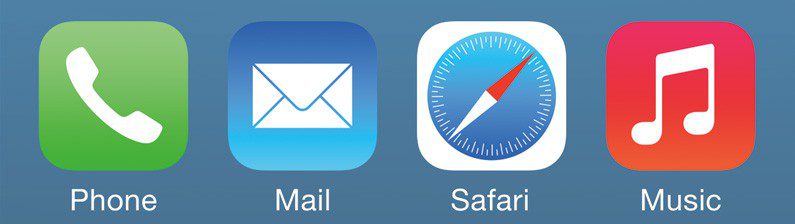
There’s lots of iconography in use today that won’t make sense to the next one or two generations of people. When was the last time you picked up a telephone that looked like that icon, or sent a letter in the mail, or used an analog compass? The younger you are, the less likely it is that you’ve had interaction with these things. In the case of Safari, even the label doesn’t help if you take the meaning literally. If I didn’t know that Safari is a web browser, I might expect this icon and label pairing to be some sort of mapping application.
In summary, metaphors can help communicate abstract ideas without much instruction, but you do risk alienating some percentage of your audience that doesn’t understand the metaphor.
Patterns
Sometimes learned behavior can inform how something should work. For instance, an image carousel is a common sight around the web. Most of them have an arrow on either side to cycle through images, and sometimes, they have navigation at the bottom to indicate both the number of items and the current item.
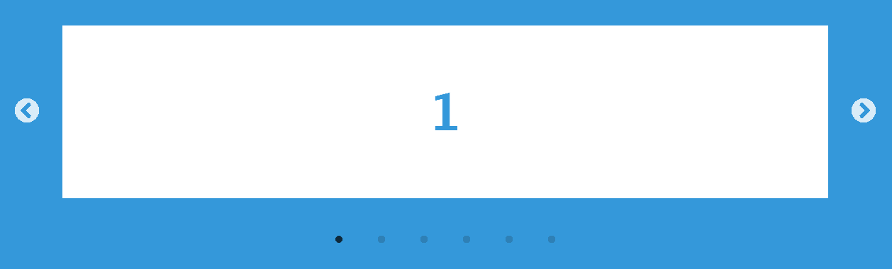
Arrows in general are a common sight on a computer. They might indicate a “breadcrumb” structure, or they might be forward and back buttons in the browser. In any case, it’s typically understood that arrows indicate some kind of navigation; they mean going somewhere. In this example, click an arrow means going to the next or previous image.
The more designers that follow the same pattern, the stronger the pattern becomes. The downside is that reliance on patterns can sometimes stifle creativity. Perhaps you’ve come up with a new and better way to navigate an information space, but it might actually be less intuitive simply because it’s not familiar. This is an important concept for designers to understand, since new user experiences are expected to be simultaneously intuitive and innovative.
More Affordances
Affordances are a fascinating topic to think about, because they don’t exist in the physical sense. Rather, affordances are implied by other design details. Something I ask myself a lot is, “At what point does a design element go from decorative to essential?” Because of affordances, it’s not always an easy question to answer. If you have any thoughts or questions that you’d like to share, I’d love to hear about them in the comments section!
Join Nick on his course How to Make a Website


Great article. So clear. One thing: I was taught that when you take a mouse with your hand and open a virtual folder, that was direct manipulation (not indirect manipulation) of a virtual object, as hand had is a physical object… Thank you kindly.
Great article. Just wanted to add few more to it based on my learning so far from UX.
Definition of Affordance: The attribute of an object to indicate a certain action to the end user.
Affordance is recognized by User Motivation.
Affordance examples in real world:- Real affordances – based on direct manipulation with the actual object
1. Throw a stone – Throwing is an affordance offered by stone as it can fit into your palm
2. Pour milk in a cup – pouring is an affordance offered by the cup due the opening on the top
Hidden affordances examples.
1. Use the coffee mug as a pot for a small plant
2. Use the stone to test gravity on a particular place, use the stone to write something on a wall
Affordance example in digital world:- Perceived affordances – based on indirect manipulation with the object in the graphical user interface.
1. Click a button – clicking is an affordance which is offered by the mouse
2. Drag a file – dragging is an affordance
3. Type a text – typing is an affordance which is offered by the keyboard
Conclusion:- If an object does not communicate an affordance clearly, then it will leave users frustrated as they do not know how to interact with an object.
Eg:- “I did not know that I can actually click that button”
Thanks designed for sharing such a fastidious opinion, article is pleasant, thats why i have read it entirely|
Is the OS X default black arrow changing to a white hand glove is another example of how we just have to get used to the behavior of some applications? It’s unnoticeable because most of us have more than 2 decades of expertise in this. But if you think it is not clear at first glance. I remember my parents double-clicking things on the web, because they probably ignored (or didn’t understand) the pointer changing the appearance.
Good Article
Well written article Nick! And really inspiring. Keep going!
– JGB!
Superb read Nick. Very informative post.
Your post contains a beautiful explanation on Labels and Metaphors. Anyone can understand how they are important to make website attractive and user friendly website.
PJ Onori (http://somerandomdude.com/2013/04/11/why-redesigning-the-save-icon-is-important/) has some pretty strong thoughts on changing the common “save” icon: the image of a floppy disk doesn’t make sense anymore. You have to admit he has a point, but this got me thinking: most digital icons are references to thinks that exist in the physical world, or to what things used to look like.
What’s a modern phone icon supposed to be – a rectangle with rounded edges? I think past a certain point the icon itself is internalized: already most people haven’t used a compass but we associate it with maps anyway. Most people do not read music themselves but the image of two eighth notes is pretty recognizable. It’s interesting to wonder if we’ll eventually ditch our current generation of icons, or if they’ll simply become associated with their intended meaning, even after we forget what the physical object is.
Really good read that!