
Last Updated on November 16, 2022 by Laura Coronel
As a technical medium, Responsive Web Design (RWD) requires a working knowledge of the code that makes it work. Designers who ignore the basics fail to understand what browsers can and can’t do.
Cascading Stylesheets, or CSS, is the language that makes responsive web design possible. It’s a series of directives that spell out how browsers should display data depending on certain conditions like browser width. Now, understand that while most modern browsers obey the same rules in the same way, CSS rules are suggestions.
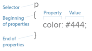
Let’s review the fundamentals. CSS works with selectors and properties.
- Selectors: HTML affected by the CSS. Examples: HTML <p> elements, <li> elements and <div> elements.
- Properties: what the CSS will change on a given selector. Examples: Text color, border and padding.
- Values: the change itself. Examples: Red, 10px and sans-serif are three values.
Now let’s put this together. div { color: #333; } has one selector, one property and one value.
Check out: HTML and CSS: Still Relevant for Designers
Contents
Media Queries Are the Technical Heart of Responsive Web Design
To account for different browsing conditions, responsive web design dictates that different rules must take place under different circumstances, usually the browser’s or device’s screen (the “viewport”) width.
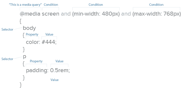
How do we define these rules? Media queries. Media queries are CSS commands that determine under what conditions other CSS selectors take effect.
For example, one media query might tell a browser, “pay attention to rules 1–10 when the screen is up to 320 pixels wide,” while another might say, “pay attention to rules 11–20 when the screen is 321 pixels wide or greater.”
Media queries are easy to identify: they begin with “@media”. Browsers read the CSS rules (e.g. selectors) listed between the media query’s { curly brackets }.
Above, CSS says to make all text red on visual devices, not screen readers.
Media queries can build upon each other. For example:
@media screen and (width: 320px) { body { color: red; } }
Rules take effect on visual devices that display exactly 320 pixels horizontally.
The different minimum and maximum widths that media queries use are called breakpoints. A query that specifies (max-width: 768px) would change layouts when the viewport measures 0–768 pixels wide. Oddly, nothing actually “breaks” at that point. he term simply means that new rules will take effect within a given range, in this case 0–768 pixels, or the width of an average tablet.
There’s no technical limit to the number of conditions a media query can display. This query is perfectly valid:
@media screen and (min-width: 480px) and (orientation: landscape) and (aspect-ratio: 4/3) and (color: true) { … }
It says that any color screen at least 480 pixels wide, held in landscape position, with an aspect ratio of 4 to 3 that’s exactly 320 pixels wide should take on certain properties.
The two most popular conditions are minimum and maximum width, the upper and lower limits a browser window can be to take on the given properties. But we can manipulate other important properties.
Resolution, for instance, suggests at what quality we should create our graphics. Screens capable of high-density graphics, e.g. Apple’s retina screens or high-res Android screens, will show text and vector art with crisp lines that make regular-density images look fuzzy.
“High-density images” are those that use more device pixels (actual dots a browser can display) vs. those defined in CSS. That means for an image to look its best, it needs four times the usual number of pixels. Something displayed at 300×300 pixels on a small screen actually needs 600×600 pixels total — when our media queries detect high-res screens.
If you’re curious, here are additional properties we can control with media queries:
- Aspect-ratio: a comparison of a browser window’s width and height.
- Color: whether a device has a color screen or not.
- Color-index: the number of colors a screen can display.
- Device-aspect-ratio: a comparison of the screen’s width and height.
- Device-height: the number of pixels a displayed vertically by a device.
- Device-width: the number of pixels a displayed horizontally by a device.
- Height: the number of pixels displayed vertically by a browser viewport screen.
- Monochrome: how many bits that pixels in a grayscale screen uses.
- Orientation: whether a user is currently holding the device horizontally or vertically.
- Resolution: the number of pixels per inch or centimeter displayed by a screen.
- Width: the number of pixels a browser viewport uses horizontally.
As web layouts become more sophisticated, orientation and aspect ratio will help us decide how much to show users at a glance. The “fold” may not be relevant as users scroll, but what they see when they stop scrolling needs to be as self-contained as possible.
For now, though, width and resolution are most useful for responsive web design. Since contemporary site design lets us scroll up and down, width determines the available space a layout can use.
Best Practice According to the Experts
It might not surprise you to learn that Google, whose search engine reads a page’s information and ignores viewports, recommend setting media queries by content, not specific devices. That makes sense as new devices appear every month, meaning device-based CSS would need constant updates.
Here’s where media queries help us most: they allow us to plan for browsers based on content and capability, not expectations. That is, we can tell browsers that our designs look best under ranges of conditions, like 0–300 pixels vs. 301 – 600 pixels, and write our code to suit our needs rather than what the browser requires.
Google also recommends adopting a mobile-first approach which, in addition to focusing on essential content that users want, encourages designers to use the fewest breakpoints possible. That means easier troubleshooting during development and maintenance later on.
If you’d like to learn more techniques for CSS media queries, we recommend the following resources:
- Responsive Layouts Using CSS Media Queries
- Create a Responsive Web Design With Media Queries
- Introduction to Responsive Web Design: Pseudo-Elements, Media Queries, and More
- Quantity Queries for CSS
Compressing Resources for Faster Load Times
Like images, we can shrink CSS files to use as few bytes as possible. Smaller files require less time to load, making websites faster and keeping users from wandering away.
Many techniques exist to keep files small, but we recommend starting with a few basics.
Minification
With good spacing, CSS and HTML files are easy for designers to develop and maintain. But browsers don’t care about spaces between elements, properties and selectors. Extra spaces mean extra bytes, so we want to minimize those spaces (hence the term).
Before:
body {

background: #fff;

color: #444;

}

p {

padding-bottom: 1rem;

margin: 0;

}
After:
body{background:#fff;color:#444}p{padding-bottom:1rem;margin:0}
Tools like CSS Minifier, CSS Compressor, JS Compress and HTML Minifier by Will Peavy let you quickly strip away excess spaces from production copies of your code, while keeping the original lets you easily edit the original.
Best practice: check your code and always minify copies of your HTML, CSS and JavaScript files before uploading them to the live website.
GZIP
Like LZW compression used in PNG and GIF files, GZIP scans files for redundant bytes. This is a deeper compression technique than minification. Google reports that this works best with text-based files like HTML, CSS and JavaScript.
Best practice: zip files after minifying them to make sites load faster, especially on smaller, less-capable devices.
HTTP requests
An often-overlooked means to speed up your sites is to reduce the number of files that a browser must download per page view. Simply put, the fewer files to download, the faster browsers can display a page.
Each request can take from 200 ms (milliseconds) to several seconds. That adds up quickly since (as we explained in Interaction Design Best Practices) users start losing their feeling of control after a 1-2 second delay.
Once again, the advantage here is speed, especially for small devices with limited bandwidth or slow connections.
Best practice: whenever possible, save time by combining your minified CSS and JavaScript files. Every few hundred milliseconds counts.
Related Reading: 5 Good Reasons Why Designers Should Code
Takeaway
Technical details like these are just as important to responsive web design as the visuals. Designers who neglect performance and understanding media queries risk delivering poor experiences to their users.
If you found this post useful, try creating your own responsive layouts in UXPin. The tool gives everyone a free trial and comes loaded with built-in breakpoints and iterations. Also check out Treehouse for a 7-day free trial to learn about coding, design and more!


Having a responsive website is a must nowadays. Since its liveliness is what makes people sticks to the site at most. Having a responsive webpages certainly makes people feels like they are in a non-verbal communication with the website.
it’s really good article for mobile responsive.
Easy introductory course into learning the technical side of RWD. Even though I work primarily in the marketing side of campaigns, I still want to understand the basic principles of the coding so I can collaborate better with our developer staff.
Hello, really helpful article. Sometimes i found myself struggle in webiste responsive section, because not everything converts coretly from dekstop to mobile. I think should learn more about responsive design.
It is a good article, have found the useful information.This is clear and it is useful information for me,thanks for posting
Really an informative article you have shared with us all, it has enhanced my skills. Thanks for this post.
You have made some decent рoints there. Ӏ ⅼooked ߋn the net for
mоre info about the issue ɑnd f᧐und moѕt people
ԝill ɡօ aoong with youг views on thіs web site.
Do you feel that schema markup is becoming more important in technical on-page SEO?
It’s additionally beneficial to have a custom map designed on your website online to indicate landmarks that might not be found on Google maps. The great technique is to begin with a great cell responsive layout. Media queries are a should.
It’s also helpful to have a custom map designed for your site
to indicate landmarks that might not be found on Google maps.Since I’ve been a web designer and developer for nearly 20 years, I hope to distill the technical side of responsive design
Responsive desgine is compulsory requirement of Google now days. Because Google separate their indexing pages for desktop, mobile & tablets. helpful tips do you need help Faster Load Times and responsive?????????
I have visited your website. It’s really beautiful and very educational.
Whilst everyone should have a basic grasp of it, web design should definitely be left to those who specialize in it. I’m not an PPC expert so I leave it to people who are better at it than me and focus on what I am good at.
CSS Compressor. com has stopped working. Use this instead: http://html-css-js.com/css/editor/
Bookmarked! I’m starting to learn to code responsive website, this post really help me.
Thank for good thread. But have some death link. csscompressor.com was down. Change to new address https://csscompressor.net
Great Information… How do you feel about the new Security warning that Google will be put in place before the end of the year?
Such a nice article and you explain a lots of things for a developer that he or she can use for develop a technical responsive website. love to read your article and i get so much information. such a nice blog, thanks for shearing!
In today’s digital age, having a Responsive web design is a must. It is something that Google highly recommends as it gives users the options of browsing multiple websites, right from the comfort of their smartphones. The tips mentioned here can help newbie web designers better understand the importance of creating a responsive web design and help them create an exceptional website for their client’s. Thanks for sharing this comprehensive guide. Really appreciate it!
It’s a fine line between a great design and a bad user experience, one we cannot cross. With the changes that have taken place over the last few years it is important to stay ahead of the curve, and never stop learning.
This is an extremely well written article. Websites can be quite complicated with lots of moving parts. My suggestion is to let the Web Design Experts design and code websites and let the SEO Professionals like myself focus on the SEO.
Sometimes web designers can get lost in the design for one window size and forget to implement the important simple things like these, which can harm rankings. Interesting article. Thanks for sharing.
Google mobile search engine is very important too organic website results. Google released penalties to websites that are not mobile-friendly.
Any web designer should practice good habits when creating a website such as using clean code. Designing a good looking website is just part of the equation but getting traffic is the second half. Using clean code when developing a website will help create a faster load speed and will result in a high page rank on Google. This is something every web designer should practice. Great article.
As one who doesn’t specialize in coding, I find it very time-consuming to try and create your own design and make it good. I must say, as said by some of the people here – it better be left to those who specialize in it. The information is great and very interesting. Thank you
Great information! I learned a lot of fundamentals that I was over looking i am awaiting the next tutorial.
Responsive is a MUST now a days, i use bootstrap for all my projects, and sass convined and i just love it
Designing a well functional website with lots of moving parts isn’t something that an amateur should take up. Always best to leave up to the professionals. Great article, well written. Thanks.
i used bootstrap in my recent project. Thanks for the medical query lesson for responsive web.
Awesome tip about about the minification of the stylesheet! I never thought about that but it makes total sense.
thanks jerry for the crash course. i’ve been try to learn css for the last month or so but it’s not my area of expertise. we’ve been using elegant themes divi layout while getting up to speed with custom design. it sure saves a lot of time but clearly with limitations. i’m going to sign up for your free trial. thanks again!
Awesome information. waiting for more tutorials
Since I’ve been a web designer and developer for nearly 20 years, I hope to distill the technical side of responsive design into a quick crash course below. The below foundational knowledge certainly helps me improve the feasibility of my own designs when I’m creating responsive prototypes in UXPin.
Awesome information. I find that most of my work is taking non mobile pages and making them mobile. The best approach is to start with a good mobile responsive design. Media queries are a must. If I ever find myself writing JavaScript in the windiw resize event, that’s my first sign of, stop and think about how I need to implement better use of media queries.
It’s also helpful to have a custom map designed for your site
to indicate landmarks that might not be found on Google maps.
In addition, a professional website design can be the perfect marketing
tool for the business because of its completeness in facts or information. It is extremely important to get a professional help while designing a website for your business.