(Photo by Andrés Nieto Porras/Flickr)
Treehouse students will often ask me which mockup tool I use to prototype websites, and my response is almost always the same: pencil and paper.
I feel like when I give this answer, there’s a small sigh of disappointment. I think it’s because people are hoping for a better way to simplify the complexities of creative problem-solving.
Even though my answer might not be very flashy, building a website with a prototype is often much faster than skipping the prototype phase. Even for a very simple website, a five-minute sketch could save hours of trial and error in the late stages. The cheaper the prototype the better because prototypes involve more iterations and refinement that can be costly.
Free trial on Treehouse: Do you want to learn more about website prototyping and design? Click here to try a free trial on Treehouse.
Contents
Start with a Pencil and Paper
It’s tempting to open Photoshop or begin coding right away because these digital tools put a cap on the level of naivety and ignorance we can display. Taking this example to the extreme, it’s arguably more intimidating to draw a house with a pencil and paper than it is to build it with LEGO blocks. However, there are several advantages to drawing websites before jumping into more concrete tools.
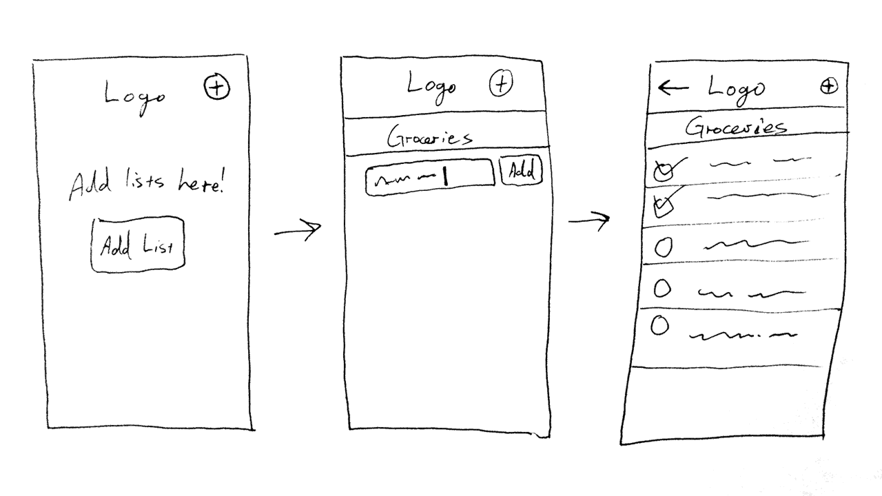
In this image, I’ve used a pen to draw some small thumbnail sketches of a todo list app.
First, I think it’s important to mock up sites starting with the cheapest tool and moving toward more expensive time investments, and there’s nothing cheaper than drawing.
When I say “cheap,” I’m describing the level of time and emotional investment — not necessarily monetary expenses. Dozens of quick thumbnail sketches can be scratched out in a few minutes. The less time I spend on an idea, the less attached I’ll be; this is good in the early phases because I don’t want to settle too soon. Now is the time to explore all the possibilities.
Second, drawing allows for maximum flexibility. Some might argue that a more robust digital mockup tool can serve the same purpose, but I disagree. Drawings are great because the level of abstraction can change wildly in a matter of seconds. One moment I might be blocking out the major columns, and the next I might be deciding on the order of navigation elements.
Intentionally or not, digital mockups tend to lock in a specific level of detail fairly early on. Paper drawings should be loose without any attention given to fonts, colors, small interface elements, and so on. At this point, I’m just marking down the big ideas.
I should note here that any drawing tool will work fine, such as a whiteboard drawing or a drawing app for a tablet device. Just as long as it allows for quick sketches, it should serve the need.
Then Move onto a Digital Mockup
Once I have a paper mockup I’m happy with, only then will I use a digital mockup tool to wireframe my ideas. I like to use Balsamiq Mockups, but another popular choice is OmniGraffle. I like Balsamiq in particular because it has some commonly used web widgets, such as video players and embedded maps. I also like that the lines aren’t perfect because it helps others understand that the lines do not represent a final result.
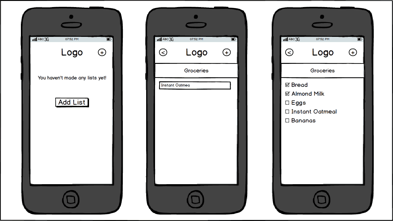
This mockup was creating using Balsamiq Mockups. Digital mockups should focus on getting spacing and the flow of screens right.
Digital mockups are helpful because they can be shared easily. They’re also more comprehensible than quick paper sketches. Stakeholders (which might include team members, customers, clients, managers, and so on) can be sent a digital mockup for review, which is key to the prototyping process. If they want to see some small changes, it’s easy to make them. If they don’t like the idea at all and want a completely new direction, then it’s easy to do a few more paper mockups and then convert them to another digital mockup.
Each level of rapid prototyping should escalate the level of detail. At this phase, I pay attention to proportions, spacing, and alignment because it can be hard to get these elements right on paper. Often, a paper mockup will not translate well to a web framework because the proportions in your mind’s eye don’t always line up with reality. That said, I’m still not concerned with fonts and colors right now. The aesthetic here should just be a simple wireframe without any coloration or shading.
Skip Photoshop (If You Can)
When I say “skip Photoshop” I mean Photoshop, Illustrator, GIMP, Pixelmator, and similar high-fidelity tools. These digital tools sit at a different tier of abstraction typically intended to provide maximum detail. This is usually bad because the pixels will almost never line up the same way in a web browser, especially when it comes to responsive design and cross-browser inconsistencies. Also, I personally feel like I’m more efficient using a web framework than I am with these heavy digital tools.
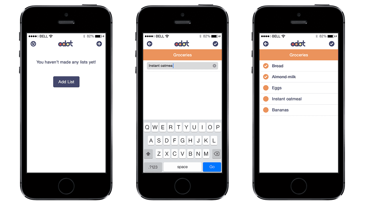
High-fidelity mockups can be powerful but time-consuming. Avoid them if you can.
These are just guidelines though, and often, I’ll still find myself in Illustrator creating more detailed imagery. However, some website designs demand to be free from the bounds of conventional text, images, and columns. They also allow for key points of collaboration on medium and large teams. A detailed mockup might take a designer some time to put together, but it could also save massive amounts of development time.
For example, at Treehouse we have about 70 employees, and we use Illustrator mockups to help us design new features before spending more resources on the code. We’ll often even use a tool like InVision to create interactive mockups to get a feel for the flow of interaction. When interaction is added, a static “mockup” makes the leap into being a “prototype” because it’s more representative of the final product.
Pushing pixels without limits has an undeniable allure of power, but it should be used responsibly. Before just opening up an image-editing program, really think about whether or not you need it. Skip Photoshop, if you can.
Use a Framework to Prototype
The last step in my rapid prototyping process is the most expensive (but usually cheaper than Photoshop). After a digital mockup, I’ll use a framework like Bootstrap or Foundation to create an interactive prototype that works in a web browser. Beyond creating paper mockups, this is the most important step because a browser is the environment that the website will be viewed in.
When using a framework, I start with placeholder elements. Foundation has several examples of what these types of prototypes might look like before adding in things like images, videos, fonts, and colors. At this point, I spend more time refining the spacing and proportions that were started in the previous digital mockup phases.
Once I’m happy with these elements, I’ll then add in as much real data as I can. This is a key step and it’s best to add data as soon as possible. (In fact, I will often add real data in the wireframing step.)
Adding in real data (and language) rather than using placeholder “lorem ipsum” text could inform design decisions. Titles that are longer than expected or paragraphs that are too short could spark some necessary iteration.
Finish Up
The wonderful thing about prototyping with a framework is that the prototype often just becomes the real site because the structure and styling are already in place. There’s no need to recreate the site from scratch if it’s going to use the same framework. It’s a good idea to discuss technology decisions with collaborators before entering this step because it would be a tremendous waste of time to mock up a site in Foundation if it’s actually Bootstrap the team wants to use.
I’ve talked about mockups in the past, but I’m so often asked this question that I thought it merited some additional explanation. This is just the process that I like to use, but if there’s a technique that makes you more efficient than most, I’d love to hear from you in the comments.




I do not know if it’s just me or if perhaps everyone else encountering issues with your blog.
It looks like some of the text on your posts are running off the screen. Can someone else please comment and let me know if
this is happening to them as well? This could be a issue with my browser because I’ve had this happen previously.
Cheers
Nice Article. It helped me think through a project I’m working on now. I am always thinking about the prototyping process and I agree using frameworks is a great time saver and most efficient. I like bootstrap!
what abut uxpin, axure or sof like this ? I agree to not use a photoshop to mockup, but this soft would be good fot this basic works.
I don’t even understand how I ended up right here, however
I thought this post was once great. I do not recognize who
you might be however certainly you’re going to a famous blogger for those
who are not already. Cheers!
Amazingly I miss Frontpage from Windows, except all the unnecessary extra crap coding but I used to do quick layout with it and then move into manual coding.
Mockplus is a bit of a pain for me creating spaces.
Nice article. Recommend you Mockplus (http://www.mockplus.com/). It is also a good tool in this field. It’s easy, simple and free. It allows you to create an app prototype page within just five minutes. The dead simple features makes you focus on your design but not the tool itself. Further, this all-in-one tool can be used to create prototypes for any mobile apps, desktop apps and web apps.
Do you agree to complete one quick sponsored provide to
gain requested Conflict of Clans sources in your account.
Hi there I am so excited I found your site, I really found you by mistake, while I was searching on Digg for something else, Regardless I am here now and would just like to say kudos for a incredible post and a all round thrilling blog (I also love the theme/design), I don’t have time to read it all at the minute but I have book-marked it and also added your RSS feeds, so when I have time I will be back to read a lot more, Please do keep up the awesome b.|
Very helpful, thanks a lot!.
Excellent post. I used to be checking constantly this blog and I’m impressed!
Very useful infro specially the remaining part 🙂 I maintain such info a lot.
I was looking for this certain information for a long time.
Thanks aand best of luck.
I agree whole-heartedly with everything you mentioned, except the photoshop mockup part. I I guess it depends on how graphics intensive the site is, but I actually use the graphics from the mock-up in my final site. Like Chris Coyier did in his Lynda.com course, “Creating WordPress themes”. Plus, it helps me develop a “mood board” to really nail down the look and feel of the site. But I’m really comfortable in photoshop, I’ve been using it for years. That’s just me. Katherine.
If you like to design a website then the best way is to create a prototype of that website on a paper before coding or designing phase because this helps a lot to rectify any type of error. The main thing is that we can also made several changes in this phase according to our requirement. Website designing needs a lot of expertise and perfection in the designing and coloring.
One thing that we do to speed up the prototyping design is we have an AppleScript that we wrote for OmniGraffle that counts up the number of each element. This helps us with both planning and budgeting, and saves time and frustration for the designers. We released the script in the blog post here: https://www.jtechcommunications.com/blog/blog-detail-12.
We’ve tried this at the agency I work at, but without success. Our customer, which rarely are educated in how websites work in general, simply can’t see through sketches, nor a prototype. At the same time, our customers have small budgets, so we can’t afford to show a great prototype either.
Right after the delivery of a site, they wanted to change like major parts of the site we’ve been communicating well throughout the entire preparation. It has been a very frustrating time.
Today we take a very, very slow approach. Instead of dealing with unexpected costs after a site is delivered, we can now have the client think it through properly and thus estimate the actual costs without much expenses afterwards.
Sometimes we do wonder how other agencies deal with this.
A little salesmanship and a lot of confidence goes a long way in this case. Sometimes the underlying goals are more important than the details.
I almost always thumbnail everything on paper. If people are looking fora little guidance with drawing, I use a metal stencil from UI stencils that’s really handy. I use the browser version and some printed browser paper or some 960 grid paper and the stencil gives me a quick way to block out elements. I don’t get anything for mentioning them, I just really dig their products.
I never thought to use frameworks in the early stages. I’ve always been taught to brainstorm and get ideas using pencil and paper first so that’s natural to me. For right now, I usually go to my text editor next and start laying out elements and seeing what actually works. I don’t like lots of steps before I get into code. I took some time to make a template of gray values and borders for various sections. So I just move elements around and adjust the gray values/hierarchy as I iterate. Once I’m satisfied, save a copy, then I replace the placeholders with actual content. I find this easy for me since I’m still figuring out my creative process and learning HTML/CSS. I guess it’s knocking out two birds with one stone. Personally, whatever I’m making I want to stay in that medium. I can see how my process works for now but I could outgrow it once I start getting professional and bigger projects.