Last Updated on May 21, 2015 by Laura Coronel
Great code and great design need each other to work well. Unfortunately, people with poor visual design skills often think they lack natural ability. In other words, there’s a common belief that you’re either born with the gift of aesthetic super powers, or you’re not. I don’t agree with this sentiment.
Just think about it for a second: If you stopped writing when you were 5 years old, you would probably be terrible at writing. The same is true for art and design. Most people stop making art right as they’re starting to master finger painting.
Fortunately, it’s never too late to learn. In fact, the added maturity makes it easier to learn a subjective topic from an objective viewpoint.
If you wear a lot of hats in a small team, or if you feel like your projects could be more successful if they looked better, this is for you. Here are five traditional elements and principles of art and design that will cure the ugly (or at least disguise it).
Contents
1. Use Negative Space
Most developers don’t pay attention to margin, padding, line-height, or any other CSS properties that add space. It’s easy to tell when a developer has designed an interface: Text runs right up against edges with no space around it and the separation between screen elements is created with lines rather than with space.
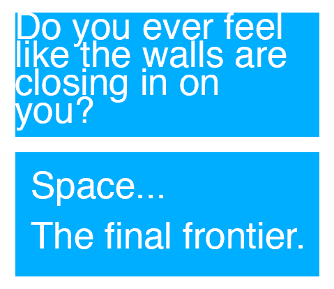
In the upper box, the text runs up against the edge and there’s no spacing between each line. The second example is much easier to read and feels more intentional.
In the domain of fine art, the area between elements is called negative space, although in other areas of design it’s often referred to as “white space.” Negative space lets the viewer quickly identify the various parts of a design. It also makes text more readable.
Here are some tips:
- Make sure that text has plenty of “breathing” room. There should be a decent amount of padding on all four sides. Text should almost never touch the edge of an element.
- Be careful of the “box-within-box” look. When page elements are separated by borders rather than being separated with margin, you end up with lots of rectangles nested inside more rectangles. Next time, when you’re tempted to add a border to something, try to add margin instead.
- Bonus tip: Try adding a little extra space to the bottom side of elements. Sometimes this creates a small visual lift and makes them appear lighter on the page. When artists cut a matte to go around a piece of artwork, they’ll often employ this visual trick by cutting the matte so that the bottom side is larger than the other sides.
Simply by using space, already you’re 100% better than most developers that attempt design work.
2. Create Contrast through Value
In music, there’s a concept called dynamics. You add emotion by playing some parts of the song at a soft volume so that loud portions sound loud, and vice versa. The same idea is true in design. When everything is bold, nothing is bold.
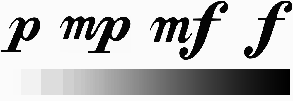
These letters are music dynamic indications, arranged from soft to loud: Piano, mezzo-piano, mezzo-forte, and forte. In design, you can adjust the visual volume by using light and dark colors. The gradient at the bottom of this image is called a value scale.
Value is a term used to describe the lightness or darkness of a color. When a light and a dark value are placed next to one another, it creates a contrast. Contrast helps the viewer identify what’s important. For example, instructional text on a form element is probably less important than a form label, so you should use a smaller font size or use grey colored text instead of strong black text. If a form label says Email: in dark bold lettering, you might need to add some supplemental text below that assures the visitor you won’t use the address they provide for nefarious purposes. This additional text isn’t as important, so you should make it look “quieter” than everything else.

When you edit your profile on Treehouse, you can type in a special URL for yourself. The dark text indicates what your unique identifier will be, and the light text fills in the rest of the URL so you know what it will ultimately look like.
The visual weight of text isn’t the only thing to keep in mind. You also need to make sure that there’s a good mix of value (light and dark areas) so that it’s easy to discern the separation between screen elements. This is a useful visual tool, because the human eye is much more capable of perceiving differences in value than differences in color.
Here are some tips:
- Similar to writing tests for code, you should also test your designs a bit. Before releasing your next design update, try viewing it in greyscale. Immediately, you’ll be able to see the darkest and lightest areas. If everything generally looks like the same shade of grey, it’s time to add some more contrast with value. Pure color is not enough to clearly separate design elements from one another; a contrast of value is more important.
- Take a screenshot of your webpage and then use an image editing tool (like Photoshop) to experiment with curves and levels. Sometimes you’ll stumble into a much more pleasing design that’s achievable with a few small CSS tweaks.
In nearly every art form, beginners are tempted to raise the volume on everything. Lowering the volume is a sign of maturity, and helps to highlight the most important parts.
3. Add Variety with Texture
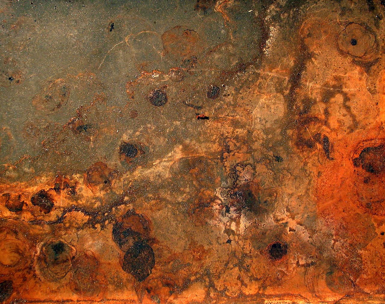
Most things in the real world are not completely flat and smooth. Texture adds variety to your interfaces. Even if you’re not trying to replicate a real surface with skueomorphism, it’s still a good idea to add a little bit of texture in a few places. Inspiration for textures are all around, in paper, metal, and stone. Even blocks of text can be considered textural. Often times, a little bit of random noise is enough to set your design apart from other flat and boring pages.
Here are some texture tips:
- Texture adds a lot of visual richness and can make a page appear to have more depth, literally and figuratively.
- If you’re using gradients or lots of subtle color transitions, then you should definitely add some light texture over top, because it will reduce color banding and make colors appear to blend more smoothly. Multiple backgrounds in CSS3 make this easy.
- Layering backgrounds with CSS3 also means that texture come at a very low file size. You can make a small square (about 256×256 pixels should do it) that’s filled with some noise and then allow the background to repeat. Then, you can reuse this file in multiple places.
4. Shape Things Up
In web design, the most overlooked element of art is shape. It might seem very obvious that there are lots of two dimensional shapes in the world, but HTML and CSS lean pretty hard towards rectangles. In fact, “the box model” is one of the most important CSS concepts to grasp. When you’re buried in code and just trying to get a database connection to work or position a background properly, it can be easy to forget something so fundamental. Non-rectangular shapes can draw attention to critically important page elements.
Just because our tools are geared towards rectangles doesn’t mean we can’t bend the rules and make other shapes. In fact, CSS allows you to create some fairly complex shapes with a little effort.
Here’s why you should use shape:
- Many objects are designed with rectangles: televisions, tables, rooms, and so on. Even if you don’t realize it consciously, curvy or irregular objects tend to stand out. Instead of calling attention to a page element using color, value, or by just making it larger on the page, try using a unique shape instead.
- Well designed iconography and logos can be recognized with just a simple shape, such as the logos for companies like Apple or Disney. When designing icons and logos, always start with a pure black shape first. Any shading and color can be added later.
- Bonus tip: If you’re trying to increase conversions to your web app and visitors aren’t clicking on your call-to-action button, try A/B testing a button with an unusual shape (for example, try an arrow instead of a rectangular button). Even if it looks a bit ugly at first, this might be enough to grab more attention.
On a related note, don’t ever let the tools define your imagination. Design first, then figure out what’s actually possible.
5. Bring in the Balance
Before you spend hours arranging every pixel and working detail into a page, it’s important to take a step back and look at the big picture. Visual balance is one of the most difficult concepts to teach with clear and direct language, but this is an instinct that can be developed quickly.
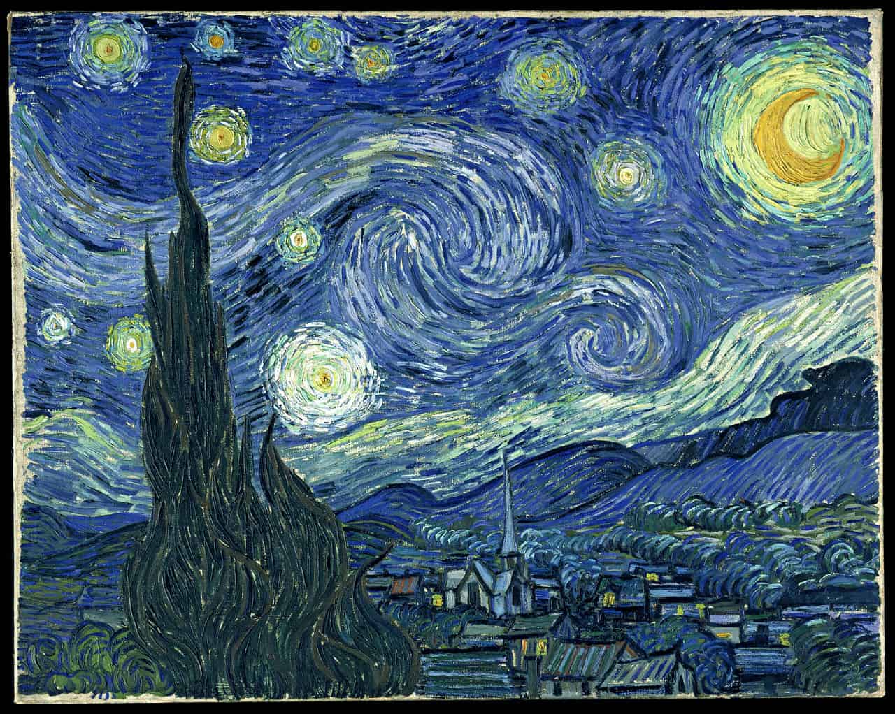
In the painting Starry Night, Van Gogh balanced the heavy dark shape on the left with a rising horizon line on the right. The brightness and unique shape of the crescent moon helps to anchor the upper right against the black void in the bottom left.
Balance is one way to think about the composition or layout of a design. It refers to the amount of visual weight that is placed on one area versus another area. This is important to get right: An unbalanced page can create a bad feeling of tension. In rare cases you can use balance to intentionally create tension (such as a website for a horror film), but on most functional web applications, this should be avoided.
It’s usually pretty easy to glance at a design and decide if one side feels heavier than another. There might be too many elements, too much contrast, too much color, and so on, versus the other side of the design. It’s also important to think about the top of the design versus the bottom, although on a vertically scrolling web page (as most web pages are), this isn’t as important as horizontal balance.
Here are some tips to make a page feel more balanced:
- Draw a vertical line down the center of the page. Does it feel like there are more things on one side than the other? The design doesn’t need to be symmetrical, but it should at least have equal weight on both sides.
- Try viewing the page upside down. This prevents your eyes from reading text and interpreting the function of UI widgets. Instead, you can’t help but notice where most of the page elements are collected. You can also try combining this with the first tip if you’re still not sure.
Conclusion
These basic elements and principles make it easy to think about design. They certainly won’t give you mystical artistic powers, but they should help you create some decent looking web pages. If you have more tips like these, I’d love to hear about them in the comments!



A
developer should think ahead of the scenario to build a fully functional and responsive website.
You should focus on the CSS formatting with the content. Every feature of the
website must be in sync with each other.
Functional and Responsive Website
There’s an ‘x’ button on the right that you can use to close it!
P.S – Remember to end a question with a question mark.
Blah, I meant ‘article’, not argument!
This is an absolutely fantastic argument. I watched some of the treehouse videos on design, but this summed things up ways better.
These design tips are really one of those tips which every designer, whether an existing one or a fresher who is about to start carrier must know this and must know how to implement it.