Last Updated on May 21, 2015 by Laura Coronel
Everyone wants to have an amazing website. We want to be able to ‘wow’ people when they come to our websites. We also want them to love the site so much they’ll come back or share it with their friends. We want our clients to love it so much, they’ll want to give a bonus — or at least a recommendation.
At the same time, it’s important to be able to create websites that can be seen. Unfortunately, it’s not just as easy as making a great design and using some excellent coding tricks. There must be support for almost every browser and it’s various versions. Building websites that are responsive for mobile web or tablets is increasingly important as well.
As much as we love the possibilities of HTML5, CSS3 and other complex languages, we must be able to build a site that utilizes the basics. I’m sure any web designer or developer has had an issue getting certain parts of CSS3 to work in Explorer, when it looks perfect in any other browser.
That’s no fun. What good is a website if it cannot be seen? And who wants to spend all their time fixing bugs? What if, even, your client doesn’t have a huge budget, but you still want them to have something that looks good?
Well, you have to be able to build a basic site that can still keep your viewer’s attention. Fortunately, there are many ways you can go about this. Below are a couple ideas and reasons that will get you prepared for making a basic, yet awesome website.
Contents
1. Movement and Animations
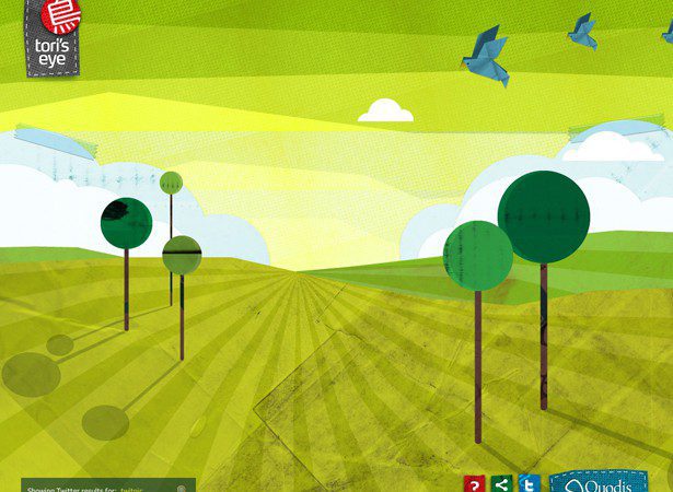
Proven and Versatile: There once was a point in time where if you wanted elements of your website to move or have animation, you would use Macromedia or Adobe flash. Flash made it possible for you to move illustrations, transform elements and bring excitement to your page.
Unfortunately, Flash has endured a painfully slow death these past couple years. Now we have come to a point where Flash is not supported on many devices or in many browsers.
Now we have alternatives which are much better. They are cross-browser friendly as well as dependent and visible on mobile devices. This is due to languages and libraries such as JavaScript, Ajax, jQuery and many more. They help turn websites from boring to amazing.
Many developers use these technologies to make their websites pop. Whether they want to fade in images or make elements fly across the page, these languages are there to help.
Light: JQuery is only about 31 or 32 KB in size. It’s very easy and quick to load. In comparison, animations using Flash would probably take up much more space. Other alternatives such as Microsoft Silverlight are heavier as well.
Languages and libraries, when coded properly and programmed properly can be extremely light. Creating fast-loading websites is important, and adding animations and movement could slow things down. However, languages and libraries, when coded properly and programmed properly can be extremely light and unobtrusive.
The trick is to use these techniques when and where you need them. Don’t bog down your site with unnecessary things, but just sprinkle them about to make an amazing website.
Excitable: Of course, any type of movement is really going to catch the attention of your audience. We’re like babies looking at mobiles, enthralled with the idea that it moves! If it’s static, we can deal with it, but it doesn’t catch our attention like movement does.
Whether it’s a simple slider or illustrations coming to life, movement makes a site just that much more interesting. The “oohs” and the “aahs” can be the thing that gets people coming back to your site and sharing it with their friends.
2. Pay attention to detail
Composition: Any artist knows that great composition takes our work from plain to great. If you draw, paint, or have ever taken a fine arts class, one of the things you must learn is composition. Sure, you may be able to draw a glass that’s across the room from you. But you create composition in the piece by including it’s surroundings and other details.
This type of composition in web design is important as well. You may create a design that you feel needs some added ‘umph’, but the truth may be that you should pay more attention to detail. Create subtle textures and patterns. Use borders to separate your elements. Even paying attention to your typography helps.
Well composed websites actually create focus and lend to a more “full” experience.
Consistent Feel: Paying attention to detail is something you have to do across the board. You cannot create a wonderful subtle texture and then disregard the treatment of your images. You can’t create a pixel perfect button in one place and ignore it in another. It has to have the same feel in order for it to make sense. Consistency is key in web design especially when you are building a brand or creating a purpose.
Better User Experience: It’s nice to sit around and talk about how wonderful a website looks or how cool a certain effect or animation is. The truth is, none of that really matters. The purpose of website is to be used for whatever it’s intended purpose is. If it cannot be used, all the fun graphics and animations are all in vain.
When you decide to pay attention to detail, you’re also saying you’re paying attention to the bigger picture. Details almost always result in better UI because you’re thinking (or should be) about what and where the user is looking.
Having a keen eye in your graphics, your coding and your decision making is extremely important. Your website must fulfill it’s greater purpose, and if it isn’t, you’re just dealing with a bunch of fluff and decorations that will render your product or services useless.
3. Some sort of video
Engages Viewer: If you’re no animator or supreme coder, you may think about engaging your viewers via video. Videos are the number one way to get the attention of your audience because a video is much more than sliding images or flying birds. A video tends to have a purpose; a timeline or a plot, if you will. Guess what? People dig this type of thing.
YouTube is the #1 website online right now. It’s not because it has a super cool web design but it’s because people like to watch videos. People like to relate to something or someone. People love stories.
If you are looking for a way to engage your audience or even just give them some basic information, consider creating a video. It can be of you talking or it can be some great big production, but give your audience something to see. It almost always makes more sense to them.
Video is Versatile: Enhancements in technology are typically great for designers. It makes life easier and allows you to do more interesting things. In this, video can be used in many ways. You can embed videos in content or you can make them the sole focus of the content.
You can even create backgrounds that are videos, straight from YouTube or Vimeo. That’s exciting! That’s often unexpected and a great way to grab the attention of visitors. I mean, who expects their website background to move around on them?
Search Engine Optimization: As we already discussed, YouTube is the #1 website in the world. The benefits of this are reaped mainly because Google owns YouTube. Uploading video on YouTube is often discovered via Google web searches and not just YouTube searches.
This means if you decide to create a video for your website, you may choose to upload it on YouTube. When you do this, you give your company more chances to get noticed because the information you put on your video can lead someone to your website.
4. Go bold
Easy to read: Back when I started making websites, the trend was to make super small copy. It was popular to use Verdana or Arial and use a font size no greater than 11. Today, that’s no longer the case and it makes sense. I often go to websites where I’m greeted by huge headlines and subtitles.
Your website has a purpose and if I cannot understand your purpose by easily reading it, your website was created in vain. If your fonts are too decorative or too small that they can’t be read, you’ve failed miserably on fulfilling the purpose.
Strong Impression: Using large text or large, bright and bold images is extremely hard to forget. Before I create a website, I often visit inspiration galleries to help with my creativity. I guarantee you that all the websites I can remember have extremely bold, yet tasteful elements. I can’t forget it!
This not only lends itself to the entire point of creating a website, but it also helps direct the eyes of your audience. Visual hierarchy tells us where to look. Contrasting colors and bright colors do the same.
If I can’t forget your website, your purposes or even just a simple image, I’d say a website is then successful and effective.
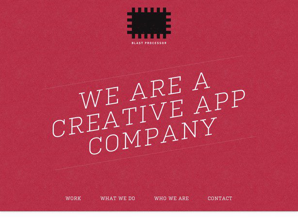
Keeping it Simple: We live in a time where minimalist ideas are very strong. I think we’ve come to a point where consumers want as little fluff as possible — they want to get straight to point with ease. Designers have picked up on that and have created very simple and straight-forward designs, all in the name of minimalism.
Minimalism is great but there’s a very thin line between it and being completely boring. Keep in mind, many consumers and viewers make no distinction between what is, and what is not, minimalist.
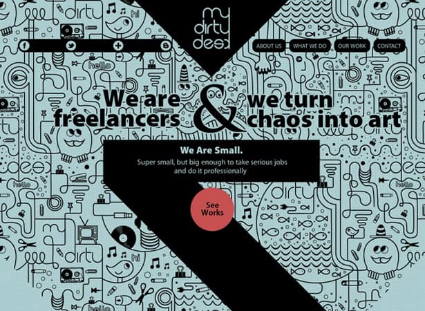
Lot’s of white space is nice, but perhaps one could fill it with a bold color or pattern. That’s sure to interest your audience and make real use of all the space. It doesn’t have to be overdone, but it can be just bold enough to make you look, without cluttering the view.
Conclusion
There’s no right way to creatively approach designing a website. There are, however, fundamentals that make it easier to create a purposeful and great website. The idea here is just to create amazing work. What have you found that works in your process? Answer below in the comments!



Always make sure that an SEO agency is open about their methodologies used – any secrecy could mean they are using “black hat” techniques. Therefore, given that marketing is so to speak at the core of any business, if you want to sell well, you have to advertise well, and you can do this on the internet, given it is the best means to help you achieve your goals to this effect due to its massive exposure and incessant expansion. Search engines take time to consider your page quality and all the other aspects of your page when you update something.