Guil Hernandez
writes on February 18, 2013
I get asked a lot about the CSS box-sizing property, especially from beginning designers and developers who’ve dealt with broken layouts and misaligned grids. The CSS box model can be a little deceiving and tricky to work with at times, so first, it’s important to understand how it works in order to better appreciate the wonders of box-sizing.
In this article, we’ll go over a few important things to know about the box model, like how it affects defining accurate fixed and fluid sizes, then learn how to tame it with the new box-sizing feature.
The Traditional Box Model
The “traditional” CSS box model, once implemented in Netscape 4 and IE 4-5, counted borders and padding as part of the width and height of a box, which at the time did not match the W3C’s standard. So when browsers started moving closer to standards compliance, it threw a monkey wrench into the development process. IE6 later developed backwards compatibility for it with Quirks Mode.
Looking back, the “IE box model” might have been something early versions of IE got right from the beginning.
The Current Box Model
The current, standard CSS box model lays out and draws padding and borders outside the width and height of the content area by adding the border-width and padding to the size of the box.
It might as well be called the content-box model because the width or height we specify is only given to the content area of the box, excluding padding and borders. Because of this, a width and height are actually rendered as:
width + padding-left + padding-right + border-left-width + border-right-width = total rendered box width
height + padding-top + padding-bottom + border-top-width + border-bottom-width = total rendered box height
This can be an issue, especially when developing the layout of a page. For example:
.box {
   width: 300px;
   padding: 20px;
}
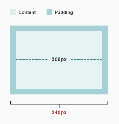
The width of .box is now increased by 40px because an additional 20px of padding has been applied to each side. So it actually renders 340px wide. The same happens when a border is applied:
.box {
   width: 300px;
   padding: 20px;
   border: 10px solid #478D93;
}
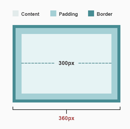
Now 20 additional pixels have been tacked on the total width –– 10px on each side. Things get even more perplexing when defining sizes in percentages:
See the Pen FyCcr by Treehouse (@Treehouse) on CodePen.
How Can We Fix This?
We could do a little math and subtract the border widths and padding from the specified width. But that can be tedious and it isn’t a bulletproof solution. We could also maybe use calc(), a new CSS function that calculates the size and shape of elements.
But again, do we really want to be concerned with more math every time we want to define a flexible width? Let’s leave the math for those px to em / percentage conversions.
So then, what do we do if we need the element to be exactly the width we specified?
An easier, more precise and battled-tested way to solve this is with the box-sizing feature, which gives us the ability to alter the way width and height are calculated.
The Magic Value
The value border-box forces the padding and borders into the width and height instead of expanding it:
.box {
   width: 300px;
   padding: 20px;
   border: 10px solid #478D93;
   box-sizing: border-box;
}
The padding and borders are laid out and drawn inside the width and height. So it dynamically subtracts the borders and padding of each side from the width and height properties we determine.

As a result, the final width of the rendered box is the actual 300px width declared, regardless of padding and borders.
box-sizing also accepts the value content-box, which is actually the default value –– sound familiar?
One Rule For All
As Paul Irish suggests, we can declare it once with the universal selector and it will work its magic throughout our project.
* {
  box-sizing: border-box;
}
“Wait, aren’t universal selectors bad practice?” The truth is, universal selectors are bad only when they are misused –– I’d say this is a good use case for it.
Conclusion
box-sizing can be applied to any element that accepts a width or height, so it makes it easier to develop with flexibility in mind and it’s one less thing to worry about when styling our pages.
Support is also great, as all major browsers (except IE7) support it. Currently, Firefox is the only browser that needs a vendor prefix, so make sure to also include the “-moz-” prefixed declaration.


Thank you Guil for the simple explanation. I now understand box-sizing.
Thanks a lot Guil! I really appreciate your way of teaching.
many thanks for the really good explanation 🙂
Got it now!
Thanks Guil, this really cleared things up for me on the box sizing.
Thanks for the article. I had a hard time understanding the box model, but this article helped me a great deal.
Thanks for great post I know understand well box-sizing.It was very helpful .
God bless u
Thank you for your amazing post, now I understand the importance of box-sizing.
Thank you for the good info. Now, everything about box sizing is crystal clear. Good job!
Excellent blog wasn’t fully certain for box sizing worked. Thanks!
I didn’t understand the box sizing till i read this entry, wow amazing post thank you