Jake Rocheleau
writes on June 24, 2013
There are plenty of great startup websites using signup forms to capture early users. Both email newsletters and user accounts are two methods for bridging new people into your startup. A crucial aspect to a successful registration form is the user interface design.
Often times designers will overlook forms in favor of other typical webpage elements like headings, graphics, sliding panels, etc. But in this article I would like to focus on various trends within login & signup forms. These are all very typical in startups which is why I have chosen to focus a bit deeper on these concepts. But generally each design principle could be applied into any style of website.
Informative Signup Tips
One of the best points to start building on would be helpful tips/hints for the user. Especially if your form has multiple inputs which may be somewhat ambiguous. These hints may be sprinkled on top of the UI as smaller labels, or even hidden as popup bubbles. The design is what gives your form character. The interface is what provides benefit to the user.
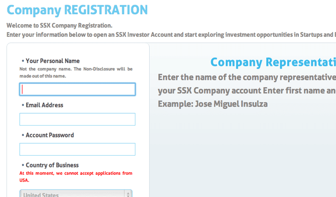
The registration page for Startup Stock Exchange is a great example of this technique scaled to a large proportion. As you focus on each individual input field you will find hints added into the right sidebar area. Each field is a common aspect like your name, email address, and account password. Visitors may skim these hints quickly and since they aren’t obtrusive to the overall website, everything blends very naturally. This is definitely the look & feel you might aspire towards when building a signup page.
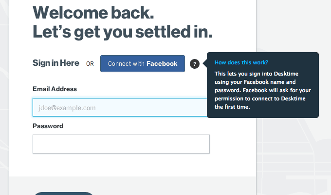
Desktime is a little different and it doesn’t use the exact popup/popover tips I was explaining. Instead you can sign up with the typical email/password combo or use Facebook direct connect. If someone is not familiar with this feature, they can simply hover the question mark icon and you get a nifty popup dialog which explains how OAuth connect works. Theoretically you could expand these popup bubbles onto any form element as needed.
Catchy User Interfaces
The aesthetics of your webpage design are almost as important as the usability factor. Obviously you want people to be using your forms and not to get confused along the way. But that doesn’t mean you have to forfeit beautiful design aspects for the sake of user experience. In fact, I would argue the UX can be expanded with the use of brilliant design colors and textures.
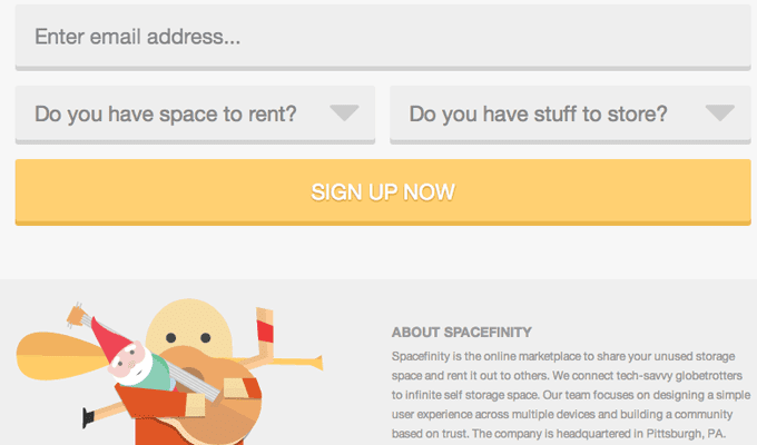
I really like the example from Spacefinity because it is located directly on their homepage. The site is an online marketplace for physical storage needs. Each of the input fields is designed in a very unique way – almost flat on the page. It takes up the entirety of the site layout and definitely captures your attention. The goal is to catch visitors early and then entice them to fill out your registration form. Using a memorable design is the perfect solution to give off the vibe that you know exactly what you’re doing (even if you don’t!).
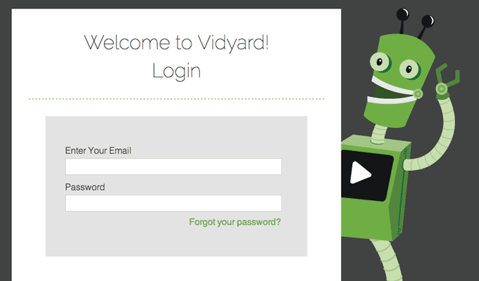
I want to contrast this example with the Vidyard login page. I would not say this form interface is all that spectacular in custom CSS design. But the webpage itself does catch your attention with the company logo and the adorable vector robot peeking out from the side. It gives off a nice branding effect which showcases a broader aspect of what the site is all about.
And remember that making mistakes on your own is part of the learning process. Don’t be afraid to jump in head-first with your own ideas and gauge visitor reaction. Then you can study which design ideas further draw people into your site and which ideas repel them away.
Mobile App Logins
There are plenty of new startups which are based solely on mobile devices. Now some of these projects will spill over into the web, which often leads to a customized web interface. But mobile app login forms are generally a lot more minimal than other startups. Plus you won’t often find registration/signup forms on the site because mobile products typically require that you download the app to register an account.
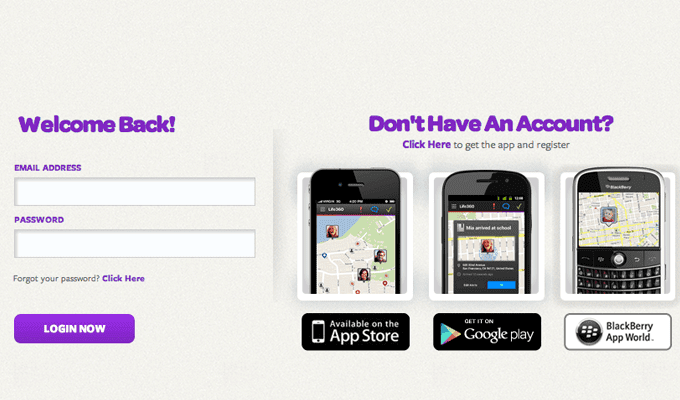
I am referencing the login page from Life360 as one such example. If you already have an account it is super easy to gain access to your profile and to reset your password. No extra elements or design features aside from the list of mobile device support. This is crucial for startups which are heavily based in the realm of mobile smartphone applications.
And why is that? Well, because the majority of any mobile startup’s functionality is within the mobile app itself. You can have people logging onto Instagram from their PC but the majority (if not all) of the submitted photos are done from a phone. So along with any login pages you should also offer visitors a chance to look into your app on the iOS/Android stores.
OAuth Connect
I mentioned OAuth earlier and I feel it is one of the bigger points moving forward through 2013. So many people are using networks which support OAuth connect well beyond Twitter or Facebook. Nowadays I see websites offering to authenticate my account through Google, Instagram, and even Github.
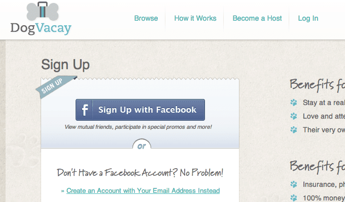
I would note that forcing users to register solely through OAuth may be considered a poor decision. Not everybody wants to connect their personal accounts into other networks, while others actually prefer the idea since it saves on the hassle of memorizing passwords. The signup page on DogVacay is a nice example where you can directly authenticate with Facebook or register a brand new account with just your e-mail address.
The signup form is originally hidden until you click a link expanding the email/password signup. By doing so it keeps the page a little cleaner and easier to skim at a glance.
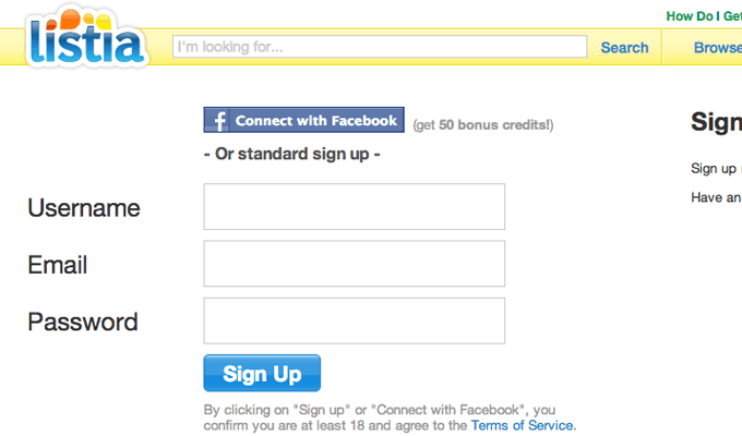
Now an interesting tidbit worth discussing is the major benefit of connecting through OAuth. You can import the user’s profile picture, username, email, and other account settings too. The signup page on Listia actually offers new users a bonus of 50 points when signing up through Facebook connect.
This concept of incentivizing registration is nothing new, but these direct connect OAuth apps are still fairly new and growing rapidly. It is worth considering if your target market includes users who may already be using such popular social networks – the signup process is a lot quicker and there are no passwords to remember, either.
Email Invitations
Early-access signups and email newsletter forms are a much different subject. For these interfaces you are only asking for a single input (email address) but they can also be a lot harder to gain traction. My reasoning is that visitors are more interested in checking out your services than getting a newsletter delivered to their inbox. Registration is a more active process because you can signup and then directly gain access into your account within minutes or even seconds.
The email invitation form on Pokke has an awesome animated effect when you focus on the input field. This does blend nicely with the entire website and it is a great example of one startup’s landing page. But my biggest problem is the lack of further interaction on the page. When your product isn’t ready this is quite acceptable but it still leaves me wanting more. It would be nice to create a new redirect page where you supply more information on the product and a potential release date for beta invites.
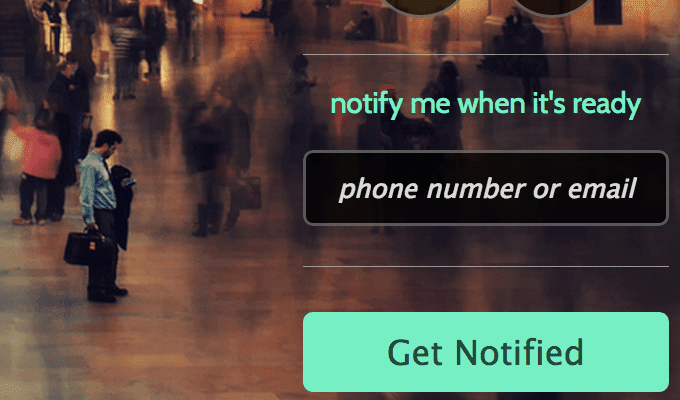
Another fullscreen background landing page for Bolt uses many of the same elements. But this site is designed for a mobile application instead. The signup form takes either your e-mail address or phone number. It is only one field and very easy to signup – but where is the ambition? If people don’t immediately know what your product does then they probably won’t go research on their own.
Try to surround your invite signup fields with more details about your product or service. People want to know in advance what they are signing up for and why they should give out their email. So be sure that your invite forms give visitors a reason to use them!
Quick Yet Efficient Designs
The final point I want to leave with is to keep all these forms as efficient as possible. This doesn’t mean you have to remove fields just to trim the form smaller, but instead try to make the progression flow quickly and almost effortlessly. I tend to find that bigger input fields make me feel more accomplished as I fill out each one.
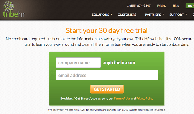
Looking at the signup page for TribeHR you can see there are only two required fields. A subdomain for the new account and the user’s e-mail address. Talk about simple! Typical registration forms will have a few more fields than this. But keeping everything simple, organized, and easy to read will expedite the time it takes for new signups.
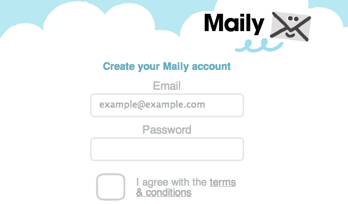
A really cute new startup named Web Maily is an e-mail service built for kids. Their signup page looks like it was designed specifically for a toddler. Just input your requested e-mail address, password, and check the box for accepting terms & conditions. All of the interface elements are big and clean – nothing else on the page to distract from the signup process.
While you are building your own signup/login pages keep asking yourself questions about the interface. Is it easy to just start typing immediately after the page finishes loading? Would you (or your mom) have the patience to use the form? What could be done to make the form even more effortless for the user? These questions will not always have perfect answers but if you keep asking questions then you’re at least working in the right direction.
Conclusion
These ideas should bolster a newfound confidence when attempting to build more enticing web forms. There is no foolproof solution to start bringing in boatloads of new registered users. It is all about testing the waters and not being afraid of failure. Because through our screw-ups we can learn what doesn’t work and what does work. Along with my ideas feel free to share your own thoughts in the post discussion area below.


Thanks for this. I would also like to suggest Custom Login Form plugin on wordpress for your website. It is designed with security, redirection and design/style features for Website and you can Customize your admin login page.
ff
[
Very cool examples! I have built a new product and released it yesterday, the login form/registration form is pretty cool combined on one page and revealed by flipping the login form over to registration form. Check it out at http://mymaplist.com/login =)
Hey Jake, great collection. Check out the pricing page we (at http://www.LoudNoises.us) designed for GinzaMetrics, it schools most of those, and is fully responsive to boot! 🙂 https://www.ginzametrics.com/plans-and-pricing/
Thanks for this step by step instructions pal, very detailed 🙂 bridges puzzles