Laura Busche
writes on June 25, 2015
Hero images are everywhere these days. You’ve probably seen them front and center in websites for apps, magazines, stores and pretty much every other product category. And with good reason: these large background images are often successful at capturing a visitor’s attention. Many designers have explored even more ways to serve hero images differently. Rotating banners, hero videos and parallax effects are some interesting variations.
Hero images are impactful, eye-catching and visually stimulating. When used well, they can make the difference between a longer visit and a bounce. If you’ve ever stared at any of these wondering how to create your own, this 5-minute guide is for you.
1. Find a striking image in high resolution.
Make sure you own the rights to this image, and that the elements in the photo do not contrast harshly against each other. Creative Market has a stock photography section with nearly 150,000 images to choose from. If you are planning on overlaying copy afterwards, make sure that there is space to accommodate it. Note: To create the scene for overlay text you could also add darker, semi-transparent layers or play with contrast and opacity (see steps 2 and 3).

Smooth Touch Interface by InspirationFeed.
2. Create a new Photoshop file with the proper size to fit your hero banner space.
Determine the exact pixel measurements for the container where you’ll insert the hero image. Open a new file and place the image that you found in step 1.


3. Decide how crisp you want it to be. Blur if necessary.
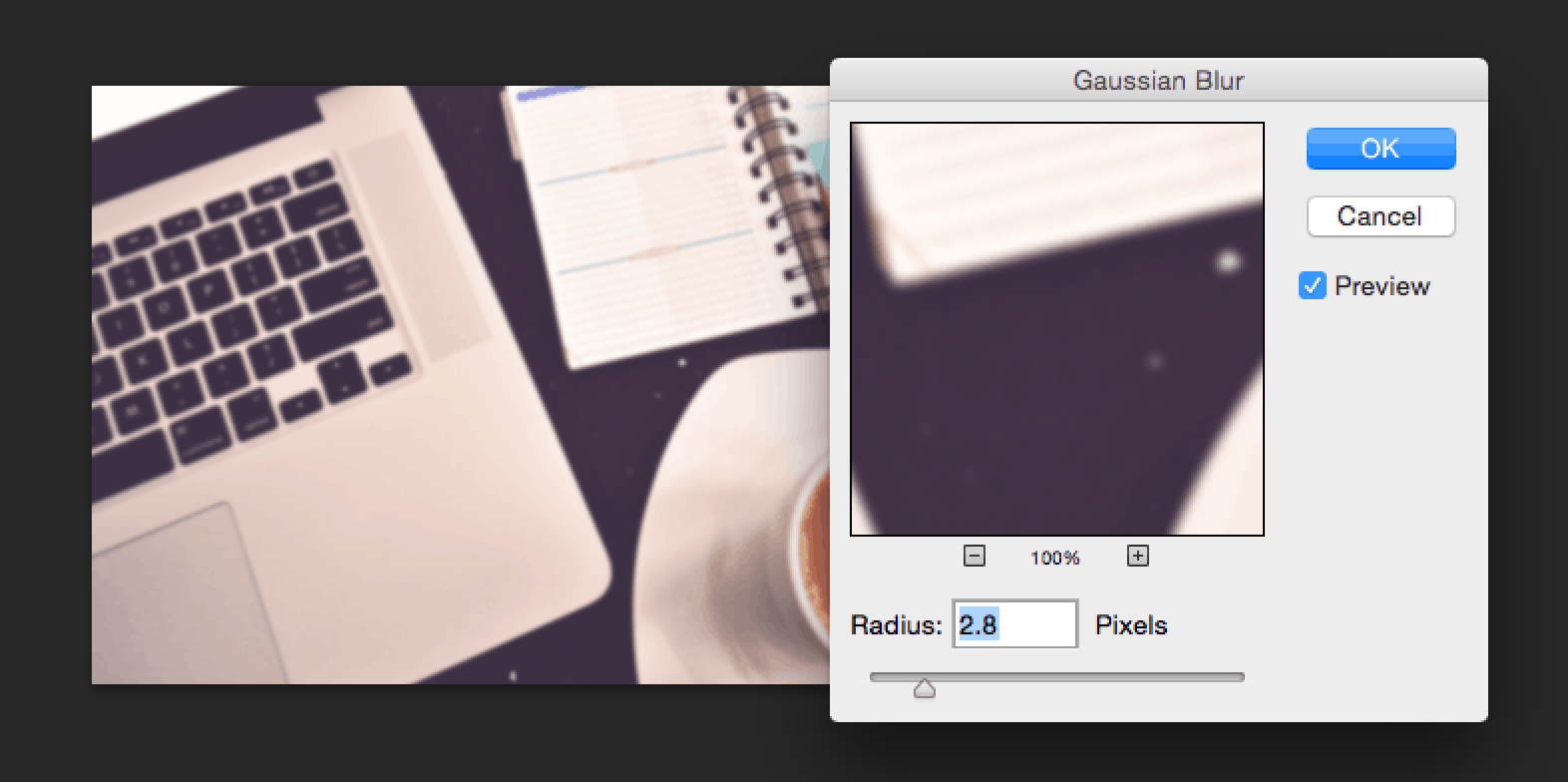
Open your image in Photoshop and use the blur filter to de-emphasize the entire photo or specific areas, as needed.
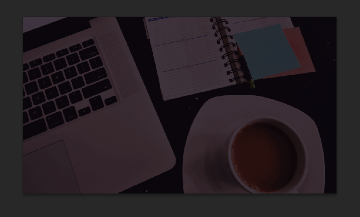
4. Decide how dark you want it to be. Add color layers if necessary.
There are a couple of techniques that you can use to achieve a more toned down look. One is to edit the image directly in Photoshop by adding a dark layer below it and assigning it a blend mode like Overlay or simply reducing opacity. The opposite also works (dark layer over photo), as do many other photography edits that you can experiment with.
Another popular technique is to create a container div that has both a dark background color and a background image with reduced opacity. In this case, the browser will render your hero image on top of the background color, adding whatever level of transparency you prefer. This approach helps preserve the integrity of the original photo, and makes future opacity changes easier to make.
5. Add hero copy.
Again, there are several ways to approach this. To make homepages easier to maintain, most designers prefer to add text directly in the HTML file rather than to rasterize it along with the image. This technique also helps plan for responsiveness: while images can be resized fairly easily for different browser sizes, it is preferable to keep text separate to preserve legibility and type integrity.
Select a suitable webfont and put together a div with an image background and properly placed text. Start planning for responsive layouts if needed.

By definition, hero images are prominent, captivating and aesthetically pleasing. They can also be incredibly challenging for developers and designers: how should we combine image and text to capture attention? How can we balance out a stunning image with equally captivating text? The answer is often in a few simple, yet powerful tweaks. Follow the 5 steps above and you’ll be creating your next hero image in no time!


How many pixels should the photo be. Right now I’m having difficulties getting my image to fit the webpage properly in CSS. I have a class container holding my h1 and nav. But my background img keeps sliding behind it. So it’s missing the top. I think it’s because my background image is in by body tag. But when I add the picture to the tag right below it it doesn’t take up the entire space.
Not sure if this is going anywhere.
Any input would be great. Thanks.